Thursday, October 17, 2013
Here's an eye-opener. Two brands of flake white, both purchased around the same time (5 or so years ago). The Williamsburg paint has turned the color of butter. I'm sure this has to do with the oil used in the paint. Williamsburg uses a "pure, premium, alkali-refined and pH balanced linseed oil." I think the Doak paint was made with a linseed/walnut oil mix.
Wednesday, October 16, 2013
Finished up the latest heat-bodied oil. It's the dark colored one above on the upper left. It'll be interesting to see how it performs. This time I tried using a cheap Presto deep fryer to heat the oil, but the temperature regulation of it was extremely poor and I think the oil might have darkened somewhat due to the big temperature fluctuations. I'll do another batch soon to try out a different method of heating. Too bad our northwest sun has gone away until next summer or else I'd place it outside to bleach it.
The top middle oil is interesting -- it was a linseed oil that was kept in a lead tray for a few weeks. It was looking pretty good and thickening up nicely, but then I placed it out in the sun for a time. The combination of sun, heat and lead transformed it into an opaque, near-gel-like consistency, but it might still be valuable in small additions.
Saturday, October 12, 2013
Spent some time washing oil again, this time linseed; the Azure Farms one. It does seem like a beautiful oil, clear and fragrant. There's something nice about it, quite unlike that atomic turmeric orange-colored stuff I bought from the supplement store. That was flax oil on steroids, I swear (got rid of the color with some time in the sun). I'm going to heat-body this one.. a hunch it might be the go-to oil for the putty I'll be using.
Picked up some more panels today. I plan to prepare a few different grounds to work on as a way to see what I like best ...gesso, gesso on linen, lead ground. even going to try out one of those Dibond panels, although foam core aluminum is not in keeping with my usual habit of sticking to the tried and true. But you never know. I'll either love it, or it will confirm the value of sticking with older materials and methods.
And the pigments... ground up some really gorgeous Spanish ochre rocks last week. The color is amazing. I have yet to see it ground in oil, but it was a pleasure to work with. Easy to grind. I tried both sieving and levigating it to compare. The levigation method is definitely superior, yielding a brighter and clearer color thanks to all the darker, denser material sinking to the bottom of the pan. I would think the grain size would be more varied, as well, compared to the sieved grains. This would suggest a more organic look and feel to the painted surface, however difficult to see with the naked eye. At least it would be more luscious to paint with, simply knowing that about it. That's what's I love about handmade materials. There's an intimacy involved in really knowing one's materials at such depths.
... that being said, I can't promise I'll ever achieve working with 100% handmade stuff. But it's a joy to work with when I can.
I want to learn "to work with the materials at a fundamental level until [I] understand them well." Tad Spurgeon speaks exactly to what I'm after. To pursue painting as a method of cultivation, much like the practice of tea. Mastery comes with intimate knowledge of not only the tea, but also the water, the method of brewing, the teaware, etc... So it is with painting, it seems. It must be approached as a discipline., with mindful dedicated practice.
Friday, October 11, 2013
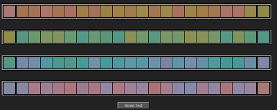
Time to resurrect the blog. Surprisingly synchronous events have taken place and I'll be back in a new studio, just a short walk from my old one, in just a few weeks time. I can hardly wait. Been hard at work preparing for the move in more ways than I care to comment on. For now, here's a fun little online test for artists and painters to check out your sensitivity to color -- http://www.xrite.com/online-color-test-challenge
The first time I tried it I got a score of 12. I had the hardest time with the blues (blue-green, blue-red). Maybe that explains my general lack of excitement for the color blue? Second time around was an 8 (damn blues). I'm having fun with this little time-waster.
The first time I tried it I got a score of 12. I had the hardest time with the blues (blue-green, blue-red). Maybe that explains my general lack of excitement for the color blue? Second time around was an 8 (damn blues). I'm having fun with this little time-waster.
Subscribe to:
Comments (Atom)


